Why north is up — and why it used to be east
There is no physical reason for north to be at the top of a map. In the Middle Ages, east was. A short history of how a habit comes to look like a law.
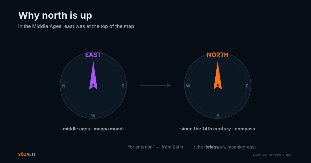
Look at the map in front of you. North is at the top. It always is. Behind something that feels this natural there is usually a law — and here there is none.
There is no up in space. Earth is a spinning ball; it has no top and no bottom. If you go looking for a physical reason to put north above south, you will not find one. It is a habit — and a habit that has already changed once.
Through much of the European Middle Ages, maps put east at the top. The reason was religious: the sun rises in the east, and Paradise was thought to lie there. That tradition still survives inside the language. The word orientation comes from the Latin oriens — the rising sun, the east. To orient yourself is, at the root of the word, to find east.
The famous T-O maps were built this way: the O was the boundary of the world, the T inside it divided the three known continents. Asia on top, Europe lower left, Africa lower right. That is not geography. It is a worldview, with the holiest direction placed above.
Then came the compass. By the 14th century the portolan charts used along the Mediterranean and Atlantic coasts were almost all drawn north-up. The reason was practical: a sailor held a magnetised needle, and the needle pointed north. Turning the chart to match the instrument in your hand is easier than rotating it in your head on every glance.
Then, in the 15th century, Ptolemy's Geography was rediscovered and translated. Ptolemy had drawn north-up — probably for no deeper reason than that most of the world he knew sat in the northern hemisphere, and Greek was read top-to-bottom, left-to-right. His authority was enormous. When Waldseemüller and Mercator produced the first great printed maps, they followed him.
So north went up, and never came down. It was not a discovery. It was authority. Whoever did the printing chose the direction.
The consequences are not small. Whatever sits at the top reads as superior to the human eye, automatically. Psychologists have measured this repeatedly: the same territory shown at the top of a map is judged wealthier, more powerful, more central. The northern hemisphere has been sitting at the top of every map for centuries.
Australia turned this into a joke. In 1979 Stuart McArthur printed his Universal Corrective Map of the World — south at the top, Australia above everything. The map is entirely accurate. It only looks wrong because we are not used to looking at it.
The feeling you get the first time you see a south-up map is the interesting part: the information is identical, the geography is identical, not one number has changed — and yet the world is unrecognisable. The only thing that moved was the frame.
News works the same way. Which story sits at the top and which sits below is never a natural ordering. Someone chooses. Usually the choosing is invisible, which is exactly why it reads as natural.
The only reason north is up is that enough people printed it that way for long enough. That is not a bad reason. It is simply a reason, and not a law.
Turn the map over. Nothing becomes false. Only the habit breaks.