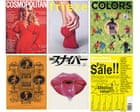
Print magazines are no longer the best way of reaching lots of people quickly and cheaply but they are still really great at engaging deeply with readers, providing an opportunity to slow down and absorb information. They provide us with an alternative way of seeing the world.” Watson, along with a group of editors, publishers, designers, historians and academics, will be discussing the varying roles and functions that magazines have played over the years during a one-day event at the forthcoming London design festival. In contrast to the doom and gloom we often hear about the print industry, he remains upbeat about the humble mag’s future.
And with every new title comes new opportunities for bold, innovative and eye-popping cover design. Here, industry experts – including many taking part in the London design festival event – pick out their favourite magazine cover designs and tell us why they find them so enduring … Scott King, ex-art director for i-D magazine and former creative director for Sleazenation Blast was published a month before Britain entered the first world war. It was an anti-petit-bourgeois rant against the professional classes.
It features lines such as “Curse abysmal inexcusable middle class” and “The britannic aesthete – cream of the snobbish earth”. It was – for want of a less gratuitous expression, given when it was published – a call to arms. It was punk 60 years before punk was invented.
In fact, Blast often reads exactly like a Fall song [the band’s singer Mark E Smith was a huge fan], with the artist and editor Wyndham Lewis piecing together phrases into a collage of barely focused loathing: “Blast the amateur, sciolast, art-pimp, journalist, self man, no-organ man.” This is a fetish magazine but it does what I think every magazine cover needs to do: seduce. It’s luring a reader in, tickling the senses, giving a flavour of what’s inside, but also tantalising whoever’s passing by. This does a great job of fulfilling that mandate of seduction.
The art itself is this incredible photorealistic airbrushed painting by Yosuke Onishi, an amazing Japanese artist who featured in every issue. So the artist gets to play, but you get this lovely consistency and distinct look, and it becomes unmistakably that magazine. It’s so lush, visceral and delicious.
The lips are dripping and they feel like they’re bursting out of the page. Steve Watson, founder of Stack magazines This is the last issue of Colors ever published and it was edited by Patrick Waterhouse, who I think is a genius. This was the year of the World Cup in Brazil, so they did a survival guide to football but they took a completely different view.
Extract — continue reading at the source.


